What’s in a Name? To Sign or Not to Sign Your Artwork.
I’ve been an artist all my life. When my painting mentor suggested I think about IF I want to sign my art at all…that was completely foreign to me. Of course I would sign my work…I have always signed my artwork! His comment did make me step back and consider why or why not to sign. He never signs his paintings and while most artists do, I was surprised to find a small but powerful contingent of artists, galleries and art appreciators who think it detracts from the art and should not be there. I’ve got my reasons for signing, but let’s look at this from all sides.
Three Reasons Artists DO Sign Their Work
Creative and Artistic Tradition
Art historian’s relish being able to identify the signature of the artist on works of art. For centuries artists have done this to signify that they believe the art is complete. It is the last thing they add to a painting and it means they are happy with the piece as it stands. Traditionally no changes will be made after it has been signed.
Increase the Value of Art
Art appraisers will tell you that a clean clear identifiable signature will most often significantly increase the value of any piece of art. Contemporary art prints and giclées (especially if they are limited edition prints) also go up in value if the artist signs them. The signature alone adds value so it’s financially beneficial to sign your work and to purchase signed art as an art collector.
To Claim it as Their Own
Putting your signature on your art proves to the world that you created, completed and approved it for all to see. When the artist is not around (and eventually you won’t be), the signature identifies it. You are literally creating a name for yourself that can lead to future sales if people can inquire about art they like. Your signature helps them find you.
Reasons NOT to Sign Work
A Signature Can Disrupt Composition
The painting is complete, and the artwork flows only to have something completely foreign dropped on top that has nothing to do with the image on the canvas. It draws attention away from the intended focal point of the piece and is unnecessary to the overall aesthetic.
The Image is Top Priority
The color, form, texture and overall emotional impact should be what attract a person to a particular piece of art. They are buying what will work well in their space and what speaks to them. They feel the signature is an afterthought or inconsequential incident, like a signed check or a credit card receipt.
How Prevalent is the “Nameless Artist” Contingent?
I was surprised, as mentioned before that my painting mentor was in this camp, but I have since run across other artists as well as a gallery that stick to their guns on this issue. In fact, I had my eye on a contemporary art gallery in Denver for possible partnership. We had been following each other and I was in the process of pulling together my submission to them. Another artist friend was also considering them and visited this gallery in person. She came back and said they are off her list because they insist that any work they carry have no signatures on them. They said it, “disrupts the composition of abstract art and their clientele don’t want someone’s name on their walls.” To both of us that felt wrong. There is a piece of the artist IN every painting and to reject who that artist is all together in my mind is to reject the art. Needless to say I did not submit my work there.
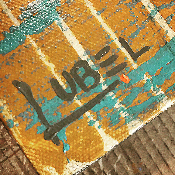
That did start the whole signature conversation between that artist and me, however, as she noticed that I sign my paintings on the lower left corner. She wondered if I was left handed but the truth is the signature or “mark” I have created for my paintings has a block “L” that holds up “UBEL.” The block fits naturally in the left corner and would feel awkward on the right. So there…it’s a design thing!
Evolution of my Art Signature
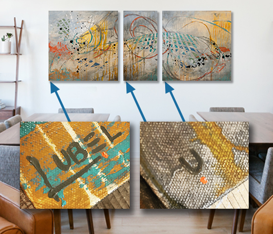
Looking back I can see the evolution of my art signature over time and how it has evolved right along with my work. As a kid it was my “teacher perfected” full cursive signature. Off to The University of Kansas Fine Art School and my signature needed to grow up, so I nixed the curly signature for the block all caps lettering (all in the lower right corners by the way). This was the way all my architect friends were writing on their blueprints. I thought it looked cool so I adopted the clean block signature in my art.
My photography has always been signed in pencil with my full signature off to the right. For larger canvas prints I shortened my signature to just “L. Ubel.” When I started painting abstract acrylics I decided something more contemporary was in order. Pulling from my graphic design background I put together a logo mark instead of using my full signature. I have decided that every painting will be signed with the “L. UBEL” mark in the lower left. Also, multi-panel pieces will have the full mark on the left panel and the additional panels in Diptychs and Triptychs would get just the “U” and a dot in the lower left corner so no canvas of mine would go unsigned.
As an artist, or collector, which side of the, “sign or not to sign” debate are you on? Let me know in a comment below…
This Post Has 0 Comments